Friday, July 29, 2016

Checking out the Oracle Reserved Words using V$RESERVED_WORDS

When working with SQL or PL/SQL we all know there are some words we cannot use in our code or to label various parts of it. These languages have a number of reserved words that form the language.
Somethings it can be a challenge to know what is or isn't a reserved word. Yes we can check the Oracle documentation for the SQL reserved words and the PL/SQL reserved words. There are other references and list in the Oracle documentation listing the reserved and key words.
But we also have the concept of Key Words (as opposed to reserved words). In the SQL documentation these are are not listed. In the PL/SQL documentation most are listed.
What is a Key Word in Oracle ?
Oracle SQL keywords are not reserved. BUT Oracle uses them internally in specific ways. If you use these words as names for objects and object parts, then your SQL statements may be more difficult to read and may lead to unpredictable results.
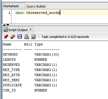
But if we didn't have access to the documentation (or google) how can we find out what the key words are. You can use the data dictionary view called V$RESERVED_WORDS.
NewImage
But this view isn't available to version. So if you want to get your hands on it you will need the SYS user. Alternatively if you are a DBA you could share this with all your developers.
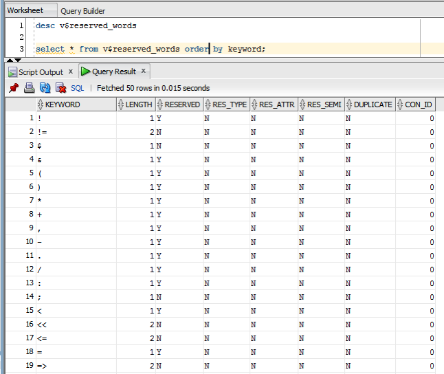
When we query this view we get 2,175 entries (for 12.1.0.2 Oracle Database).
NewImage

Tuesday, July 26, 2016

Oracle Text, Oracle R Enterprise and Oracle Data Mining - Part 1

A project that I've been working on for a while now involves the use of Oracle Text, Oracle R Enterprise and Oracle Data Mining. Oracle Text comes with your Oracle Database licence. Oracle R Enterprise and Oracle Data Mining are part of the Oracle Advanced Analytics (extra cost) option.

What I will be doing over the course of 4 or maybe 5 blog posts is how these products can work together to help you gain a grater insight into your data, and part of your data being large text items like free format text, documents (in various forms e.g. html, xml, pdf, ms word), etc.

Unfortunately I cannot show you examples from the actual project I've been working on (and still am, from time to time). But what I can do is to show you how products and components can work together.

In this blog post I will just do some data setup. As with all project scenarios there can be many ways of performing the same tasks. Some might be better than others. But what I will be showing you is for demonstration purposes.

The scenario: The scenario for this blog post is that I want to extract text from some webpages and store them in a table in my schema. I then want to use Oracle Text to search the text from these webpages.

Schema setup: We need to create a table that will store the text from the webpages. We also want to create an Oracle Text index so that this text is searchable.

drop sequence my_doc_seq;
create sequence my_doc_seq;

drop table my_documents;

create table my_documents (
doc_pk number(10) primary key, 
doc_title varchar2(100), 
doc_extracted date, 
data_source varchar2(200), 
doc_text clob);

create index my_documents_ot_idx on my_documents(doc_text) 
indextype is CTXSYS.CONTEXT;

In the table we have a number of descriptive attributes and then a club for storing the website text. We will only be storing the website text and not the html document (More on that later). In order to make the website text searchable in the DOC_TEXT attribute we need to create an Oracle Text index of type CONTEXT.

There are a few challenges with using this type of index. For example when you insert a new record or update the DOC_TEXT attribute, the new values/text will not be reflected instantly, just like we are use to with traditional indexes. Instead you have to decide when you want to index to be updated. For example, if you would like the index to be updated after each commit then you can create the index using the following.

create index my_documents_ot_idx on my_documents(doc_text) 
indextype is CTXSYS.CONTEXT
parameters ('sync (on commit)');

Depending on the number of documents you have being committed to the DB, this might not be for you. You need to find the balance. Alternatively you could schedule the index to be updated by passing an interval to the 'sync' in the above command. Alternatively you might want to use DBMS_JOB to schedule the update.

To manually sync (or via DBMS_JOB) the index, assuming we used the first 'create index' statement, we would need to run the following.

EXEC CTX_DDL.SYNC_INDEX('my_documents_ot_idx');

This function just adds the new documents to the index. This can, over time, lead to some fragmentation of the index, and will require it to the re-organised on a semi-regular basis. Perhaps you can schedule this to happen every night, or once a week, or whatever makes sense to you.

BEGIN
  CTX_DDL.OPTIMIZE_INDEX('my_documents_ot_idx','FULL');
END;

(I could talk a lot more about setting up some basics of Oracle Text, the indexes, etc. But I'll leave that for another day or you can read some of the many blog posts that already exist on the topic.)

Extracting text from a webpage using R: Some time ago I wrote a blog post on using some of the text mining features and packages in R to produce a word cloud based on some of the Oracle Advanced Analytics webpages. I'm going to use the same webpages and some of the same code/functions/packages here. The first task you need to do is to get your hands on the 'htmlToText function. You can download the htmlToText function on github. This function requires the 'Curl' and 'XML' R packages. So you may need to install these. I also use the str_replace_all function ("stringer' R package) to remove some of the html that remains, to remove some special quotes and to replace and occurrences of '&' with 'and'. # Load the function and required R packages source("c:/app/htmltotext.R") library(stringr)
data1 <- str_replace_all(htmlToText("http://www.oracle.com/technetwork/database/options/advanced-analytics/overview/index.html"), "[\r\n\t\"\'\u201C\u201D]" , "")
data1 <- str_replace_all(data1, "&", "and")
data2 <- str_replace_all(str_replace_all(htmlToText("http://www.oracle.com/technetwork/database/options/advanced-analytics/odm/index.html"), "[\r\n\t\"\'\u201C\u201D]" , ""), "&", "and")
data2 <- str_replace_all(data2, "&", "and")
data3 <- str_replace_all(str_replace_all(htmlToText("http://www.oracle.com/technetwork/database/database-technologies/r/r-technologies/overview/index.html"), "[\r\n\t\"\'\u201C\u201D]" , ""), "&", "and")
data3 <- str_replace_all(data3, "&", "and")
data4 <- str_replace_all(str_replace_all(htmlToText("http://www.oracle.com/technetwork/database/database-technologies/r/r-enterprise/overview/index.html"), "[\r\n\t\"\'\u201C\u201D]" , ""), "&", "and")
data4 <- str_replace_all(data4, "&", "and")
We now have the text extracted and cleaned up. Create a data frame to contain all our data: Now that we have the text extracted, we can prepare the other data items we need to insert the data into our table ('my_documents'). The first stept is to construct a data frame to contain all the data.
data_source = c("http://www.oracle.com/technetwork/database/options/advanced-analytics/overview/index.html",
                 "http://www.oracle.com/technetwork/database/options/advanced-analytics/odm/index.html",
                 "http://www.oracle.com/technetwork/database/database-technologies/r/r-technologies/overview/index.html",
                 "http://www.oracle.com/technetwork/database/database-technologies/r/r-enterprise/overview/index.html")
doc_title = c("OAA_OVERVIEW", "OAA_ODM", "R_TECHNOLOGIES", "OAA_ORE")
doc_extracted = Sys.Date()
data_text <- c(data1, data2, data3, data4)

my_docs <- data.frame(doc_title, doc_extracted, data_source, data_text)

Insert the data into our database table: With the data in our data fram (my_docs) we can now use this data to insert into our database table. There are a number of ways of doing this in R. What I'm going to show you here is how to do it using Oracle R Enterprise (ORE). The thing with ORE is that there is no explicit functionality for inserting and updating records in a database table. What you need to do is to construct, in my case, the insert statement and then use ore.exec to execute this statement in the database.

library(ORE)
ore.connect(user="ora_text", password="ora_text", host="localhost", service_name="PDB12C", 
            port=1521, all=TRUE) 

for(i in 1:nrow(my_docs)) {
  insert_stmt <- "BEGIN insert_tab_document ('"
  insert_stmt <- paste(insert_stmt,  my_docs[i,]$doc_title, sep="")
  insert_stmt <- paste(insert_stmt, "', '",  my_docs[i,]$doc_extracted, "'", sep="")
  insert_stmt <- paste(insert_stmt, ", '",  my_docs[i,]$data_source, sep="")
  insert_stmt <- paste(insert_stmt, "', '",  my_docs[i,]$data_text, "');", " END;", sep="")
  ore.exec(insert_stmt)
}
ore.exec("commit")

You can now view the inserted webpage text using R or using SQL.

In my next blog post in this series, I will look at how you can use the ORE embedded features to read and process this data.
Monday, July 11, 2016

Creating ggplot2 graphics using SQL

Did you read the title of this blog post! Read it again.

Yes, Yes, I know what you are saying, "SQL cannot produce graphics or charts and particularly not ggplot2 graphics".

You are correct to a certain extent. SQL is rubbish a creating graphics (and I'm being polite).

But with Oracle R Enterprise you can now produce graphics on your data using the embedded R execution feature of Oracle R Enterprise using SQL. In this blog post I will show you how.

1. Pre-requisites

You need to have installed Oracle R Enterprise on your Oracle Database Server. Plus you need to install the ggplot2 R package.

In your R session you will need to setup a ORE connection to your Oracle schema.

2. Write and Test your R code to produce the graphic

It is always a good idea to write and test your R code before you go near using it in a user defined function.

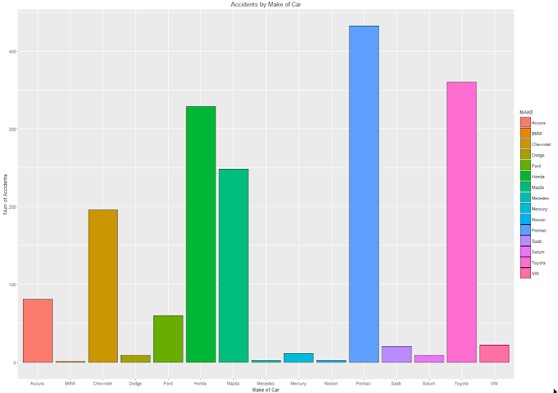
For our (first) example we are going to create a bar chart using the ggplot2 R package. This is a basic example and the aim is to illustrate the steps you need to go through to call and produce this graphic using SQL.

The following code using the CLAIMS data set that is available with/for Oracle Advanced Analytics. The first step is to pull the data from the table in your Oracle schema to your R session. This is because ggplot2 cannot work with data referenced by an ore.frame object.

data.subset <- ore.pull(CLAIMS) 

Next we need to aggregate the data. Here we are counting the number of records for each Make of car.

aggdata2 <- aggregate(data.subset$POLICYNUMBER,
                      by = list(MAKE = data.subset$MAKE),
                      FUN = length)

Now load the ggplot2 R package and use it to build the bar chart.

ggplot(data=aggdata2, aes(x=MAKE, y=x, fill=MAKE)) + 
       geom_bar(color="black", stat="identity") +
       xlab("Make of Car") + 
       ylab("Num of Accidents") + 
       ggtitle("Accidents by Make of Car")

The following is the graphic that our call to ggplot2 produces in R.

NewImage

At this point we have written and tested our R code and know that it works.

3. Create a user defined R function and store it in the Oracle Database

Our next step in the process is to create an in-database user defined R function. This is were we store R code in our Oracle Database and make this available as an R function. To create the user defined R function we can use some PL/SQL to define it, and then take our R code (see above) and in it.

BEGIN
   -- sys.rqScriptDrop('demo_ggpplot');
   sys.rqScriptCreate('demo_ggpplot', 
      'function(dat) {
         library(ggplot2)
         
         aggdata2 <- aggregate(dat$POLICYNUMBER,
                      by = list(MAKE = dat$MAKE),
                      FUN = length)

        g <-ggplot(data=aggdata2, aes(x=MAKE, y=x, fill=MAKE)) + geom_bar(color="black", stat="identity") +
                   xlab("Make of Car") + ylab("Num of Accidents") + ggtitle("Accidents by Make of Car")

        plot(g)
   }');
END;

We have to make a small addition to our R code. We need need to include a call to the plot function so that the image can be returned as a BLOB object. If you do not do this then the SQL query in step 4 will return no rows.

4. Write the SQL to call it

To call our defined R function we will need to use one of the ORE SQL API functions. In the following example we are using the rqTableEval function. The first parameter for this function passes in the data to be processed. In our case this is the data from the CLAIMS table. The second parameter is set to null. The third parameter is set to the output format and in our case we want this to be PNG. The fourth parameter is the name of the user defined R function.

select *
from table(rqTableEval( cursor(select * from claims),
                        null,
                        'PNG',
                        'demo_ggpplot'));                        

5. How to view the results

The SQL query in Step 4 above will return one row and this row will contain a column with a BLOB data type.

NewImage

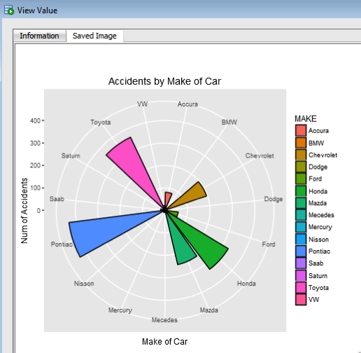
The easiest way to view the graphic that is produced is to use SQL Developer. It has an inbuilt feature that allows you to display BLOB objects. All you need to do is to double click on the BLOB cell (under the column labeled IMAGE). A window will open called 'View Value'. In this window click the 'View As Image' check box on the top right hand corner of the window. When you do the R ggplot2 graphic will be displayed.

NewImage

Yes the image is not 100% the same as the image produced in our R session. I will have another blog post that deals with this at a later date.

But, now you have written a SQL query, that calls R code to produce an R graphic (using ggplot2) of our data.

6. Now you can enhance the graphics (without changing your SQL)

What if you get bored with the bar chart and you want to change it to a different type of graphic? All you need to do is to change the relevant code in the user defined R function.

For example, if we want to change the graphic to a polar plot. The following is the PL/SQL code that re-defines the user defined R script.

BEGIN
   sys.rqScriptDrop('demo_ggpplot');
   sys.rqScriptCreate('demo_ggpplot', 
      'function(dat) {
         library(ggplot2)
         
         aggdata2 <- aggregate(dat$POLICYNUMBER,
                      by = list(MAKE = dat$MAKE),
                      FUN = length)

         n <- nrow(aggdata2)
         degrees <- 360/n

        aggdata2$MAKE_ID <- 1:nrow(aggdata2)

        g<- ggplot(data=aggdata2, aes(x=MAKE, y=x, fill=MAKE)) + geom_bar(color="black", stat="identity") +
               xlab("Make of Car") + ylab("Num of Accidents") + ggtitle("Accidents by Make of Car") + coord_polar(theta="x") 
        plot(g)
   }');
END;

We can use the exact same SQL query we defined in Step 4 above to call the next graphic.

NewImage

All done.

Now that was easy! Right?

I kind of is easy once you have been shown. There are a few challenges when working in-database user defined R functions and writing the SQL to call them. Most of the challenges are around the formatting of R code in the function and the syntax of the SQL statement to call it. With a bit of practice it does get easier.

7. Where/How can you use these graphics ?

Any application or program that can call and process a BLOB data type can display these images. For example, I've been able to include these graphics in applications developed in APEX.

Tuesday, July 5, 2016

Cluster Distance using SQL with Oracle Data Mining - Part 4

This is the fourth and last blog post in a series that looks at how you can examine the details of predicted clusters using Oracle Data Mining. In the previous blog posts I looked at how to use CLUSER_ID, CLUSTER_PROBABILITY and CLUSTER_SET.

In this blog post we will look at CLUSTER_DISTANCE. We can use the function to determine how close a record is to the centroid of the cluster. Perhaps we can use this to determine what customers etc we might want to focus on most. The customers who are closest to the centroid are one we want to focus on first. So we can use it as a way to prioritise our workflows, particularly when it is used in combination with the value for CLUSTER_PROBABILITY.

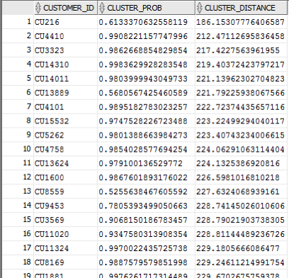
Here is an example of using CLUSTER_DISTANCE to list all the records that belong to Cluster 14 and the results are ordered based on closeness to the centroid of this cluster.

SELECT customer_id, 
       cluster_probability(clus_km_1_37 USING *) as cluster_Prob,
       cluster_distance(clus_km_1_37 USING *) as cluster_Distance
FROM   insur_cust_ltv_sample
WHERE   cluster_id(clus_km_1_37 USING *) = 14
order by cluster_Distance asc;

Here is a subset of the results from this query.

NewImage

When you examine the results you may notice that the records that is listed first and closest record to the centre of cluster 14 has a very low probability. You need to remember that we are working in a N-dimensional space here. Although this first record is closest to the centre of cluster 14 it has a really low probability and if we examine this record in more detail we will find that it is at an overlapping point between a number of clusters.

This is why we need to use the CLUSTER_DISTANCE and CLUSTER_PROBABILITY functions together in our workflows and applications to determine how we need to process records like these.

Thursday, June 30, 2016

googleVis R package for creating google charts in R

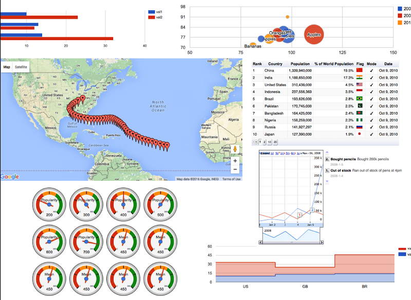
I've recently come across the 'googleVis' R package. This allows you to create a variety of different (typical and standard) charts in R but with the look and feel of the charts we can get from a number of different Google sites.

I won't bore you with some examples in the post but I'll point you to a good tutorial on the various charts.

Here is the link to the mini-tutorial.

Before you can use the package you will need to install it. The simplest way is to run the following in your R session.

> install.packages("googleVis")

Depending on your version of R you may need to upgrade.

Here is a selection of some of the charts you can create, and there are many, many more.

NewImage

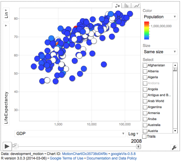
Some of you might be familiar with the presenting that Hans Rosling gives. Some of the same technology is behind these bubble charts from Google, as they bought the software years ago. Hans typically uses a data set that consists of GDP, Population and Life Expectancy for countries around the World. You too can use this same data set and is available from rdatamarket. The following R codes will extract this data set to you local R session and you can then use it as input to the various charts in the googleVis functions.

install.packages("rdatamarket")
library(rdatamarket)
dminit(NULL)

# Pull in life expectancy and population data
life_expectancy <- dmlist("15r2!hrp")
population <- dmlist("1cfl!r3d")

# Pull in the yearly GDP for each country
gdp <- dmlist("15c9!hd1")

# Load in the plyr package
library("plyr")

# Rename the Value for each dataset
names(gdp)[3] <- "GDP"

# Use plyr to join your three data frames into one: development 
gdp_life_exp <- join(gdp, life_expectancy)
names(gdp_life_exp)[4] <- "LifeExpectancy"
development <- join(gdp_life_exp, population)
names(development)[5] <- "Population"

Here is an example of the bubble chart using this data set.

NewImage

There are a few restrictions with using this package. All the results will be displayed in a web browser, so you need to make sure that this is possible. Some of the charts are require flash. Again you need to make sure you are the latest version and/or you many have restrictions in your workplace on using it.

Thursday, June 23, 2016

Cluster Sets using SQL with Oracle Data Mining - Part 3

This is the third blog post on my series on examining the Clusters that were predicted by an Oracle Data Mining model. Check out the previous blog posts.

In the previous posts we were able to list the predicted cluster for each record in our data set. This is the cluster that the records belonged to the most. I also mentioned that a record could belong to many clusters.

So how can you list all the clusters that the a record belongs to?

You can use the CLUSTER_SET SQL function. This will list the Cluster Id and a probability measure for each cluster. This function returns a array consisting of the set of all clusters that the record belongs to.

The following example illustrates how to use the CLUSTER_SET function for a particular cluster model.

SELECT t.customer_id, s.cluster_id, s.probability
FROM   (select customer_id, cluster_set(clus_km_1_37 USING *) as Cluster_Set
        from   insur_cust_ltv_sample 
        WHERE  customer_id in ('CU13386', 'CU100')) T,
      TABLE(T.cluster_set) S
order by t.customer_id, s.probability desc; 

The output from this query will be an ordered data set based on the customer id and then the clusters listed in descending order of probability. The cluster with the highest probability is what would be returned by the CLUSTER_ID function. The output from the above query is shown below.

NewImage

If you would like to see the details of each of the clusters and to examine the differences between these clusters then you will need to use the CLUSTER_DETAILS function (see previous blog post).

You can specify topN and cutoff to limit the number of clusters returned by the function. By default, both topN and cutoff are null and all clusters are returned.

- topN is the N most probable clusters. If multiple clusters share the Nth probability, then the function chooses one of them.

- cutoff is a probability threshold. Only clusters with probability greater than or equal to cutoff are returned. To filter by cutoff only, specify NULL for topN.

You may want to use these individually or combined together if you have a large number of customers. To return up to the N most probable clusters that are greater than or equal to cutoff, specify both topN and cutoff.

The following example illustrates using the topN value to return the top 4 clusters.

SELECT t.customer_id, s.cluster_id, s.probability
FROM   (select customer_id, cluster_set(clus_km_1_37, 4, null USING *) as Cluster_Set
        from   insur_cust_ltv_sample 
        WHERE  customer_id in ('CU13386', 'CU100')) T,
      TABLE(T.cluster_set) S
order by t.customer_id, s.probability desc;

and the output from this query shows only 4 clusters displayed for each record.

NewImage

Alternatively you can select the clusters based on a cut off value for the probability. In the following example this is set to 0.05.

SELECT t.customer_id, s.cluster_id, s.probability
FROM   (select customer_id, cluster_set(clus_km_1_37, NULL, 0.05 USING *) as Cluster_Set
        from   insur_cust_ltv_sample 
        WHERE  customer_id in ('CU13386', 'CU100')) T,
      TABLE(T.cluster_set) S
order by t.customer_id, s.probability desc;

and the output this time looks a bit different.

NewImage

Finally, yes you can combine these two parameters to work together.

SELECT t.customer_id, s.cluster_id, s.probability FROM (select customer_id, cluster_set(clus_km_1_37, 2, 0.05 USING *) as Cluster_Set from insur_cust_ltv_sample WHERE customer_id in ('CU13386', 'CU100')) T, TABLE(T.cluster_set) S order by t.customer_id, s.probability desc;

Thursday, June 16, 2016

Cluster Details with Oracle Data Mining - Part 2

This is the second blog post of my series on examining the clusters that are predicted for by an Oracle Data Mining model for your data. In my previous blog post I should you how to use CLUSTER_ID and CLUSTER_PROBABILITY functions. These are the core of what you will be used when working with clusters and automating the process.

In this blog post I will look at what details are used by the clustering model to make the prediction. The function that you can use is called CLUSTER_DETAILS. I had an earlier blog post on using PREDICTION_DETAILS to see some of the details that are produced when performing classification.

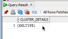
CLUSTER_DETAILS returns the cluster details for each row in the selection. The return value is an XML string that describes the attributes of the highest probability cluster.

Here is an example of using the CLUSTER_DETAILS function in a SELECT statement.

select cluster_details(clus_km_1_37, 14 USING *) as Cluster_Details
from   insur_cust_ltv_sample 
where  customer_id = 'CU13386';

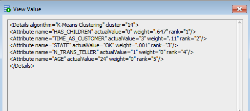
The output is an XML string and the easiest way to view this is in SQL Developer. It will list the top 5 highest weighted attributes for the cluster centroid.

NewImage NewImage

The returned attributes are ordered by weight. The weight of an attribute expresses its positive or negative impact on cluster assignment. A positive weight indicates an increased likelihood of assignment. A negative weight indicates a decreased likelihood of assignment. By default, CLUSTER_DETAILS returns the attributes with the highest positive weights in defending order.

Tuesday, June 7, 2016

Examining predicted Clusters and Cluster details using SQL

In a previous blog post I gave some details of how you can examine some of the details behind a prediction made using a classification model. This seemed to spark a lot of interest. But before I come back to looking at classification prediction details and other information, this blog post is the first in a 4 part blog post on examining the details of Clusters, as identified by a cluster model created using Oracle Data Mining.

The 4 blog posts will consist of:

  • 1 - (this blog post) will look at how to determine the predicted cluster and cluster probability for your record.
  • 2 - will show you how to examine the details behind and used to predict the cluster.
  • 3 - A record could belong to many clusters. In this blog post we will look at how you can determine what clusters a record can belong to.
  • 4 - Cluster distance is a measure of how far the record is from the cluster centroid. As a data point or record can belong to many clusters, it can be useful to know the distances as you can build logic to perform different actions based on the cluster distances and cluster probabilities.

Right. Let's have a look at the first set of these closer functions. These are CLUSTER_ID and CLUSTER_PROBABILITY.

CLUSER_ID : Returns the number of the cluster that the record most closely belongs to. This is measured by the cluster distance to the centroid of the cluster. A data point or record can belong or be part of many clusters. So the CLUSTER_ID is the cluster number that the data point or record most closely belongs too.

CLUSTER_PROBABILITY : Is a probability measure of the likelihood of the data point or record belongs to a cluster. The cluster with the highest probability score is the cluster that is returned by the CLUSTER_ID function.

Now let us have a quick look at the SQL for these two functions. This first query returns the cluster number that each record most strong belongs too.

SELECT customer_id, 
       cluster_id(clus_km_1_37 USING *) as Cluster_Id, 
FROM   insur_cust_ltv_sample
WHERE  customer_id in ('CU13386', 'CU6607', 'CU100');

NewImage

Now let us add in the cluster probability function.

SELECT customer_id, 
       cluster_id(clus_km_1_37 USING *) as Cluster_Id,
       cluster_probability(clus_km_1_37 USING *) as cluster_Prob       
FROM   insur_cust_ltv_sample
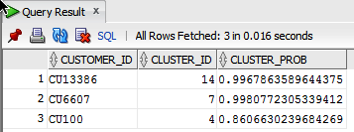
WHERE  customer_id in ('CU13386', 'CU6607', 'CU100');

NewImage

These functions gives us some insights into what the cluster predictive model is doing. In the remaining blog posts in this series I will look at how you can delve deeper into the predictions that the cluster algorithm is make.

Monday, May 30, 2016

PREDICTION_DETAILS function in Oracle

When building predictive models the data scientist can spend a large amount of time examining the models produced and how they work and perform on their hold out sample data sets. They do this to understand is the model gives a good general representation of the data and can identify/predict many different scenarios. When the "best" model has been selected then this is typically deployed is some sort of reporting environment, where a list is produced. This is typical deployment method but is far from being ideal. A more ideal deployment method is that the predictive models are build into the everyday applications that the company uses. For example, it is build into the call centre application, so that the staff have live and real-time feedback and predictions as they are talking to the customer.

But what kind of live and real-time feedback and predictions are possible. Again if we look at what is traditionally done in these applications they will get a predicted outcome (will they be a good customer or a bad customer) or some indication of their value (maybe lifetime value, possible claim payout value) etc.

But can we get anymore information? Information like what was reason for the prediction. This is sometimes called prediction insight. Can we get some details of what the prediction model used to decide on the predicted value. In more predictive analytics products this is not possible, as all you are told is the final out come.

What would be useful is to know some of the thinking that the predictive model used to make its thinking. The reasons when one customer may be a "bad customer" might be different to that of another customer. Knowing this kind of information can be very useful to the staff who are dealing with the customers. For those who design the workflows etc can then build more advanced workflows to support the staff when dealing with the customers.

Oracle as a unique feature that allows us to see some of the details that the prediction model used to make the prediction. This functions (based on using the Oracle Advanced Analytics option and Oracle Data Mining to build your predictive model) is called PREDICTION_DETAILS.

When you go to use PREDICTION_DETAILS you need to be careful as it will work differently in the 11.2g and 12c versions of the Oracle Database (Enterprise Editions). In Oracle Database 11.2g the PREDICTION_DETAILS function would only work for Decision Tree models. But in 12c (and above) it has been opened to include details for models created using all the classification algorithms, all the regression algorithms and also for anomaly detection.

The following gives an example of using the PREDICTION_DETAILS function.

select cust_id, 
       prediction(clas_svm_1_27 using *) pred_value,
       prediction_probability(clas_svm_1_27 using *) pred_prob,
       prediction_details(clas_svm_1_27 using *) pred_details
from mining_data_apply_v;

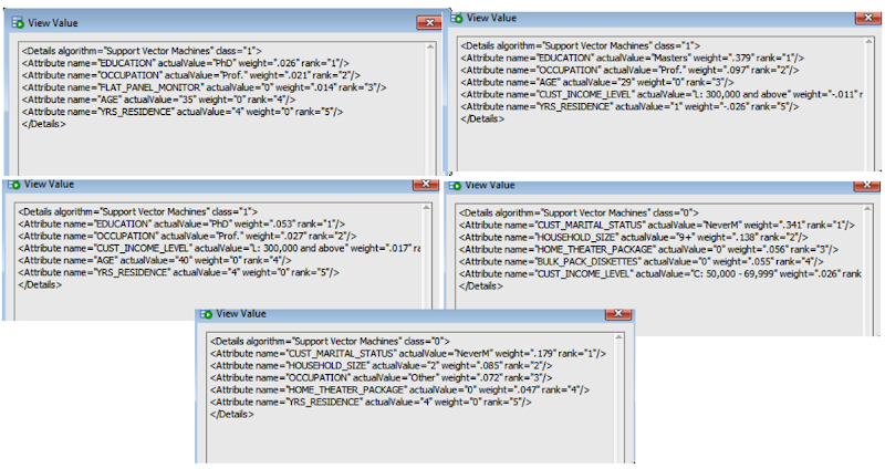
The PREDICTION_DETAILS function produces its output in XML, and this consists of the attributes used and their values that determined why a record had the predicted value. The following gives some examples of the XML produced for some of the records.

NewImage

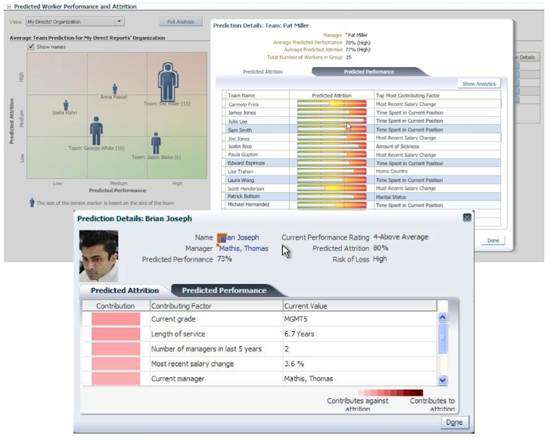
I've used this particular function in lots of my projects and particularly when building the applications for a particular business unit. Oracle too has build this functionality into many of their applications. The images below are from the HCM application where you can examine the details why an employee may or may not leave/churn. You can when perform real-time what-if analysis by changing some of attribute values to see if the predicted out come changes.

NewImage

Friday, May 6, 2016

Advanced Analytics in Oracle Data Visualization Desktop

Oracle Data Visualisation Desktop has the feature of being able to include some advanced analytics. In a previous blog post I showed you how to go about installing Oracle R Distribution on your desktop/client machine. This will allow you to make use of some of the advanced analytics features of Oracle Data Visualization Desktop.

The best way to get started with using the advanced analytics features of Oracle Data Visualization Desktop, is to ignore that these features exist. Start with creating your typical analytics, charts etc. Only then you can really look at adding some of the advanced analytics features.

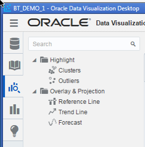
To access the advanced analytics features you can select the icon from the menu bar for advanced analytics. It is the icon with the magnifying glass.

NewImage

When you have listed on this icon the advanced analytics menu opens displaying the 5 advanced analytics options available to you.

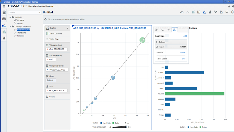
With your chart/graphic already created then you can click on one of the advanced analytics options and drag it onto your char or onto the palette for the chart. For example in the following diagram the Outlier option was selected and dragged into the Color section. This will then mark Outlier data on your chart with a different color.

NewImage

You can follow a similar approach with all the other advanced analytics options. Click and drag. It is that simple. As you add each advanced analytics option, the chart will be updated automatically for you.

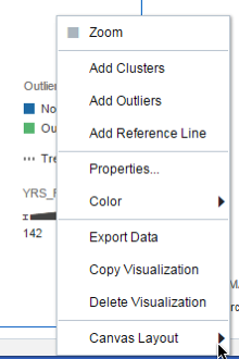
An alternative to clicking and dragging from the chart options palette, you can right click on the chart (or click on the wheel on the top right hand corner of the chart window), and then select the advanced analytics feature you want from the menu.

NewImage

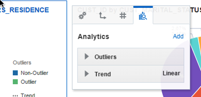
or what I prefer doing is to select Properties from the menu above. When you do this you get a new window opening and when you click on the icon with the magnifying glass you get to add and customize the advanced analytics features.

NewImage

WARNING

I would urge caution when you are reading other demonstrations about Oracle Visualization Desktop that are showing examples of predictive analytics. There are a few blog posts out there and also some videos too.

What they are actually showing you is the embedded R execution feature of Oracle R Enterprise. Oracle R Enterprise is part of the Oracle Advanced Analytics Option, which is a licensed option.

So if you follow these blog posts and videos, thinking that you can do this kind of advanced analytics, you could be getting into license issues. This confusion is not helped with comments like the following on the Oracle website.

"Predictive Analytics: Analytics has progressed from providing oversight to offering insight, and now to enabling foresight. Oracle Data Visualization supports that progression, delivering embedded predictive capabilities that enable anyone to see trend lines and other visuals with a click, and extend their analysis using a free R download."

Personally I find this a bit confusing. Yes you can perform some advanced and predictive analytics with Oracle Data Visualization, but you need to ensure that you are using the client side R installation, for your analytics.

As with all licensing questions, you should discuss them with your Oracle Sales representative.

Tuesday, May 3, 2016

Oracle Data Visualisation Desktop : Enabling Advanced Analytics (R)

Oracle Data Visualization comes with all the typical features you have with Visual Analyzer that is part of BICS, DVCS and OBIEE.

An additional install you may want to do is to install the R language for Oracle Data Visualization Desktop. This is required to enable the Advanced Analytics feature of the tool.

NewImage

After installing Data Visualisation Desktop when you open the Advanced Analytics section and try to add one of the Advanced Analytics graphing option you will get an errors message as, shown below.

NewImage

In Windows, click on the Start button, then go to Programs and then Oracle. In there you will see a menu item called install Advanced Analytics i.e. install Oracle R Distribution on your machine.

NewImage

When you click on this menu option a new command line window will open and will proceed with the installation of Oracle R Distribution (in this case version 3.1.1, which is not the current version of Oracle R Distribution).

NewImage NewImage

By accepting the defaults and clicking next, Oracle R Distribution will be installed. The following images will step you through the installation.

NewImage NewImage

NewImage NewImage

NewImage NewImage

NewImage NewImage

NewImage

The final part of the installation is download and install lots and lots of supporting R packages.

NewImage

When these supporting R packages have been installed, you can now use the Advanced Analytics features of Oracle Data Visualisation Desktop.

If you had the tool open during this installation you will need to close/shutdown the tool and restart it.

Saturday, April 30, 2016

Oracle Data Visualisation : Setting up a Connection to your DB

Using Oracle Data Visualisation is just the same or very similar as to using the Cloud version of the tool.

In this blog post I will walk you through the steps you need to perform the first time you use the Oracle Data Visualization client tool and to quickly create some visualizations.

Step 1 - Create a Connection to your Oracle DB and Schema

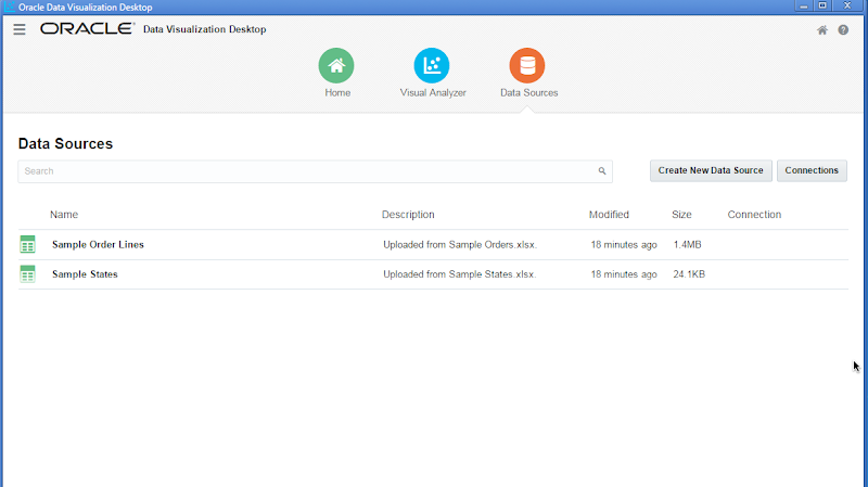
After opening Oracle Data Visualisation client tool client on the Data Sources icon that is displayed along the top of the screen.

NewImage

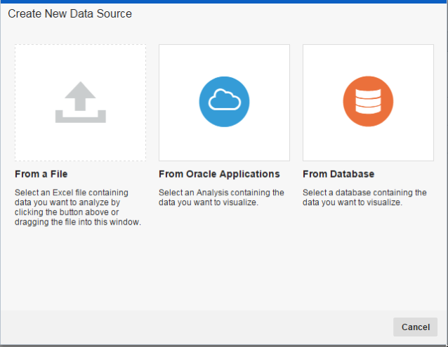
Then click on the 'Connection' button. You need to create a connection to your schema in the Oracle Database. Other options exist to create a connection to files etc. But for this example click on 'From Database.

NewImage

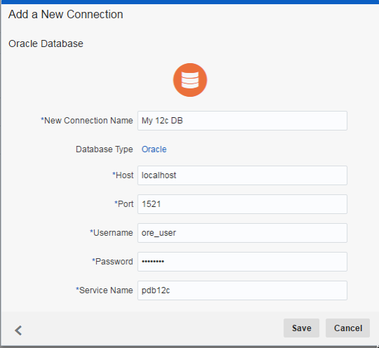
Enter you connections details for your schema in your Oracle Database. This is exactly the same kind of information that you would enter for creating a SQL Developer connection. Then click the Save button.

NewImage

Step 2 - Defining the data source for your analytics

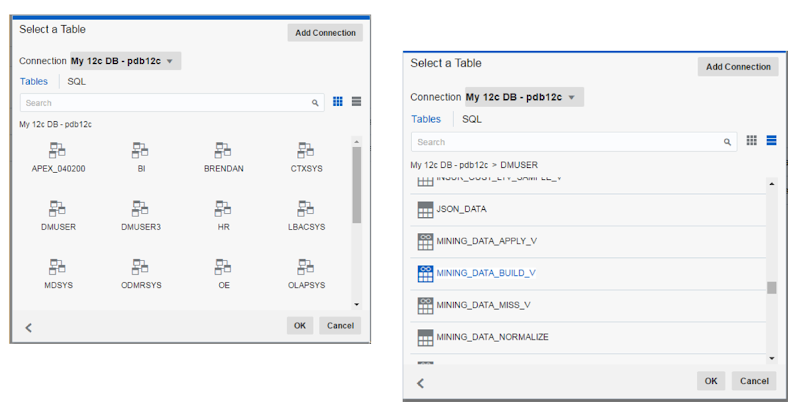
You need to select the tables or views that you are going to use to build up your data visualizations. In the Data Sources section of the tool (see the first image above) click on the 'Create Data New Data Source' button and then select 'From Database'. The following window (or one like it) will be displayed. This will contain all the schemas in the DB that you have some privileges for. You may just see your schema or others.

Select your schema from the list. The window will be updated to display the tables and views in the schema. You can change the layout from icon based to being a list. You can also define a query that contains the data you want to analyse using the SQL tab.

NewImage

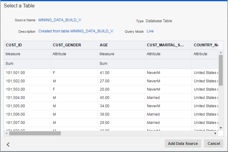
When you have select the table or view to use or have defined the SQL for the data set, a window will be displayed showing you a sample of the data. You can use this window to quickly perform a visual inspection of the data to make sure it is the data you want to use.

NewImage

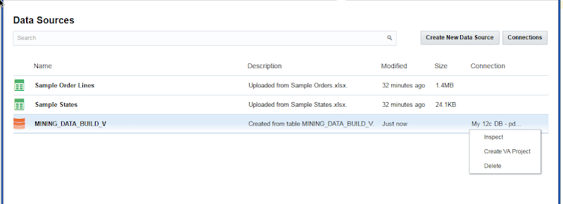
The data source you have defined will now be listed data sources part of the tool. You can click on the option icon (3 vertical dots) on the right hand side of the data source and then select Create VA Project from the pop up menu.

NewImage

Step 3 - Create your Oracle Data Visualization project

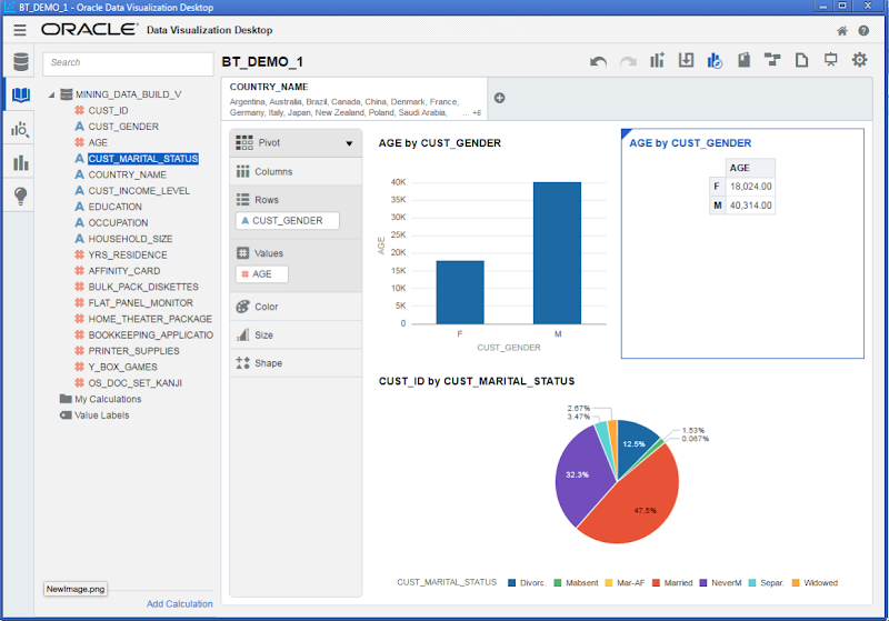
When the Visual Analyser part of the tool opens, you can click and drag the columns from your data set on to the workspace. The data will be automatically formatted and displayed on the screen. You can also quickly generate lots of graphics and again click and drag the columns on the graphics to define various element.

NewImage